weblim
September 27, 2024
Imagine this:
You pick up your phone to visit a website. But the words are too small. The buttons are hard to tap. The page takes forever to load.
Frustrating, right?
Now imagine a website made just for your phone. Big, easy-to-read text. Buttons you can tap without zooming in. Fast loading.
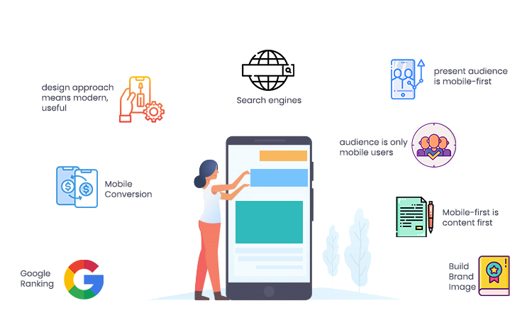
That’s mobile-first design!
It means building websites for phones first, then making them work on bigger screens like tablets and computers.
Why?
Because most people use phones to browse the web now.
If your website isn’t phone-friendly, you’re losing visitors—and maybe even customers!
In this post, we’ll explain:
What mobile-first design really means.
Simple steps to make your website phone-friendly.
Let’s go!
Mobile-first design means building websites for phones first.
Then we make them work on bigger screens like tablets and computers.
Most people use phones to browse the web today.
If your site isn’t phone-friendly, visitors will leave quickly.
Here’s how it works:
Start with the smallest screen. Focus only on what’s most important.
Use big buttons and simple menus. Make sure everything loads fast.
After the phone version works perfectly, add extras for larger screens. This keeps the site clean and fast on all devices.
The old way was backwards:
Build for desktop
Try to squeeze it onto phones
This often created slow, frustrating mobile experiences.
Mobile-first is better because:
Pages load faster
Buttons are easier to tap
Google ranks your site higher
Users stay longer
Big companies like Amazon and Google use this approach. They know most visitors come from phones first.
In 2025, mobile-first isn’t optional. It’s how all good websites are built. Start small, then grow. Your visitors (and Google) will thank you.
Want to see the difference? Try browsing your site on a phone right now. Is it easy to use? If not, it’s time for a mobile-first redesign.
When designing for mobile first, you need to be very selective about what appears on the screen.
Phone screens are small, so you can’t show everything at once.
Think carefully about what your visitors absolutely need to see immediately – this might be your main product, a key message, or important action buttons.
Everything else should either be removed completely or placed further down the page where users can scroll to find it if they want.
This focused approach helps visitors quickly find what they need without getting overwhelmed.
Mobile users interact with their fingers, not a precise mouse cursor.
This means every interactive element needs to be designed for touch.
Buttons should be large enough that people can easily tap them without accidentally hitting the wrong one – a good minimum size is about the width of an adult fingertip.
Leave plenty of space around buttons and links so users don’t get frustrated by accidental taps.
Consider placing key navigation elements at the bottom of the screen where they’re easier to reach with one-handed use, rather than forcing users to stretch their thumbs to the top.
Visual elements need special attention on mobile devices.
Images should be simple and focused – avoid complex pictures with small details that get lost on small screens.
Text needs to be large enough to read comfortably without zooming – a good rule is to make body text at least 16 pixels in size.
Choose fonts that remain clear and readable even on smaller screens, avoiding fancy or decorative fonts that might become hard to read.
Make sure there’s enough contrast between text and background colors so everything is visible in different lighting conditions.
Mobile users often browse on the go and expect pages to load almost instantly.
Optimize every element to be as lightweight as possible.
Compress images without losing quality, using modern formats like WebP that offer better compression.
Minimize the amount of code your page needs to load. Consider lazy loading techniques where non-essential elements only load when the user scrolls down to them.
Remember that many mobile users may be on slower cellular connections or limited data plans, so every kilobyte you save makes a difference.
There’s no substitute for real-world testing.
Don’t just check your design on a computer simulator – try it on actual phones with different screen sizes and operating systems.
Pay special attention to how touch interactions feel – buttons should respond immediately when tapped, and forms should be easy to fill out without constant zooming in and out.
Test your site in different environments – how does it look in bright sunlight?
Can you still use it with one hand while holding a coffee in the other?
These real-world tests often reveal problems you’d never find in a design studio.
Designing mobile-first isn’t just a trend – it’s the smart way to build websites today.
Most of your visitors are using phones, so your website should be built for them first.
Remember these key points:
Start small and simple, then grow
Every tap and swipe should feel natural
Speed matters more than ever
What works on phones usually works everywhere
The best websites don’t just “work” on mobile – they’re designed for mobile from the ground up.
If you want a fast, high-converting mobile first website but don’t know where to start, book a “Fix My Website” session today. Let’s make sure your site is ready for 2025 and beyond!

2025 Weblim | All rights reserved | Terms & Conditions | Privacy Policy | Refund Policy