Animations might look flashy, but they often do more harm than good—especially on a landing page.
Here’s why:
Every second your page takes to load is a second closer to someone hitting the “back” button.
People don’t have time to wait for sliding banners, bouncing icons, or loading spinners.

And let’s be honest—most of these animations don’t help your visitor understand your offer any better.
Think about it this way: when someone visits your landing page, they want clarity, not a light show.
Instead of animations, use clean, static elements.
Focus on powerful words, strong headlines, and high-quality images.
That’s what sells—not things flying across the screen.
A good test: open your landing page on a mobile phone with a weak connection.
If it feels slow or laggy, it’s time to simplify.
Pro tip: Remove animation libraries from your site and test your speed using tools like PageSpeed Insights.
You’ll often see an instant improvement.
Your landing page should never leave your visitor wondering, “What do I do next?”
People scroll fast, especially on mobile.
And if your Call-to-Action (CTA) button is only at the top or bottom, chances are most visitors will miss it.
That’s why you should place a CTA button every two screens worth of content.
It’s like giving them regular invitations to take action as they scroll.
Each button doesn’t have to say the same thing.
Use different versions like:
“Start Free Trial”
“Get My Offer”
“See Plans”
“Join the Waitlist”
These buttons are like checkpoints on a journey—easy exits when your visitor is ready.
.webp)
Pro tip: Keep your CTA buttons bold, visible, and full-width on mobile. Make it easy to tap with one thumb.
Everyone knows reviews matter.
But before you show a testimonial from a happy customer, try showing what industry experts or recognized professionals are saying about your product.
Why?
Because people trust authority.
If someone they look up to—or even recognize—recommends your product, that trust transfers.
Let’s say you’re selling a fitness app. You could write:
“Used by over 10,000 people.”
That’s nice.
But how about:
“Recommended by top fitness coaches on Instagram and YouTube.”
That hits harder. And if you can quote someone by name or show their face (with permission), even better.

You can also include logos of podcasts you’ve appeared on, blogs that featured you, or YouTube channels that mentioned your product.
Make expert praise the first thing visitors see—before they read the rest.
It makes everything else more believable.
Let’s be honest—money makes people hesitate.
Even if your product is amazing, people get nervous when it’s time to pull out their credit card.
But here’s what changes everything:
A simple refund policy right next to your pricing.
Add a short line like:
“30-day money-back guarantee—no questions asked.”
This one sentence lowers anxiety.
It tells visitors, “You’re not taking a risk.
If you don’t like it, you’ll get your money back.”
It also shows confidence in your product.

If you’re willing to refund people, you must really believe in what you’re offering.
Place this refund policy in a bold, visible spot, right near the price or payment button.
It’s a tiny tweak with a big impact.

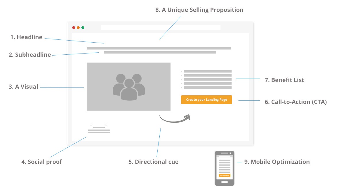
A great headline does two things:
👉 It speaks to the mind (logic)
👉 And it speaks to the heart (emotion)
You need both.
Logic tells your visitor why your product is useful.
Emotion makes them feel something, and that’s what drives action.
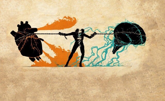
Let’s break it down with an example:
“Boost Your Sales (and Finally Get More Sleep)”
The first part—“Boost Your Sales”—speaks to the brain.
The second part—“Finally Get More Sleep”—touches the heart.
People don’t just want more sales.
They want peace of mind, better sleep, and less stress.
When you include both benefits, you’re hitting two powerful reasons to say yes.
Pro tip: When writing your headline, ask:
What’s the hard benefit? (money, time, growth)
What’s the soft reward? (freedom, relief, happiness)
Combine both in one sentence. That’s a winning formula.
Your product might have 20 amazing features, but your visitor won’t remember all of them.
So don’t try to list everything. Instead, choose the top 3 or 4 features that really matter.
These should be:
The most unique
The most useful
The most impressive
Keep it focused.
Visitors will remember the highlights, not the fine print.
For example:
✅ “One-click setup”
✅ “Real-time data syncing”
✅ “Mobile-friendly dashboard”
Simple. Clear. Memorable.
When you give fewer options, people make decisions faster.
That’s the psychology of clarity.
First impressions matter.
And online, they happen in seconds.
So start your page with instant trust signals.
Add a bite-sized piece of social proof near your headline.
Something like:
⭐⭐⭐⭐⭐ “Rated 4.9/5 by 2,000 users”
“As seen on Forbes, TechCrunch & Mashable”
“Used by top teams at Google and Spotify”
Why it works:
Visitors think, “Oh, this is legit.”
It breaks down resistance right away.
Don’t hide this trust-building info at the bottom of your page. Lead with it.
Give your audience confidence from the first scroll.
Let’s be real—nobody loves being sold to.
Words like “Buy Now” or “Purchase” sound like a commitment.
They can make your offer feel heavy, even if it’s great.
Instead, use lighter, friendlier phrases that feel like an invitation:
“Get Started”
“Try It Free”
“Unlock Access”
“See It In Action”
These words reduce friction.
They feel easy and low-pressure.
You’re not pushing someone to buy—you’re inviting them to explore.
And that subtle shift makes a big difference.
Colors carry emotion.
And in the tech world—especially in AI and innovation—purple stands out.
It signals:
Creativity
Futuristic thinking
High-tech innovation
That’s why so many AI tools and SaaS companies use shades of purple in their branding.
You don’t need to turn your whole site purple.
Just use it as an accent:
Call-to-action buttons
Headline highlights
Icons or borders
It sends the right visual message.
In a world where first impressions matter, even your color palette tells a story.
Everyone loves a good story—especially when it’s real.
If you built your product to solve a personal problem or fix a frustration, share that origin story.
Example:
“We were tired of slow software that kept crashing. So we built something faster—and never looked back.”
Stories like this do two things:
They show you understand the problem.
They create an emotional connection with your visitor.
When someone sees that your product was born out of real pain, they’re more likely to trust it.
They might even think:
“Hey, I’ve had that same issue. This might be exactly what I need.”
Just a few lines of story can be more powerful than a long list of specs.
Some words have a special kind of magic.
They’re short. They’re strong.
And they stick in your visitor’s mind.
We call them power words—and examples include:
Fast
Easy
Guaranteed
Secure
Proven
These words instantly create feelings of safety, speed, and reliability.
But here’s the trick: don’t just use them once.
Use them multiple times—in your:
Headline
Subheadings
Buttons
Feature descriptions
Why?
Because repetition creates familiarity.
And familiarity builds trust.
Think of your landing page like a song—your power words are the chorus.
Repeat them 3–5 times so that by the time someone finishes reading, they remember:
“This is fast. This is easy. And it’s guaranteed.”
That’s what helps turn a visitor into a buyer.
A logo can do a lot more than you think.
It’s a visual shortcut to trust.
If your product has been:
Featured in media (blogs, news sites, podcasts)
Used by known brands or happy clients
Show their logos near the top or middle of your page.

Example:
“As seen in Forbes, Wired, and TechRadar”
“Trusted by teams at Amazon, Spotify, and HubSpot”
Even if visitors don’t read the full article or case study, the logos alone boost credibility.
It says:
“Others trust us—you can too.”
If you’re just starting out, even small mentions or partnerships are worth showing off.
Use every bit of trust you’ve earned.
Every visitor has a voice in their head whispering questions like:
“What if this doesn’t work for me?”
“Is it really worth the money?”
“Do I need tech skills to use this?”
That’s why your FAQ section matters more than you think.
Don’t just answer easy questions like “How do I create an account?”
Go deeper.
Tackle the hard ones—the questions people are scared to ask.
Examples:
“What if I don’t see results?”
“Do I need to know coding to use this?”
“Can I cancel anytime?”
When you answer these upfront, you remove doubts.
And the more doubts you remove, the closer they are to clicking “Buy.”
Honesty and clarity in your FAQ builds trust—even more than a fancy design.
Too many choices = decision fatigue.
When people see 5 or 6 pricing options, they freeze up.
They overthink.
And they leave.
Instead, keep it simple:
Basic
Pro
Business (or Team/Agency)

And here’s a little trick: highlight the middle one as “Most Popular.”
Why?
Because people often choose the middle ground.
It feels safer than “too cheap” or “too expensive.”
Use layout and color to make the “Most Popular” plan stand out.
This nudges people toward the option you want them to pick.
Keep the pricing section clean, easy to compare, and not too crowded. Simplicity sells.
People don’t buy products—they buy results.
Don’t just tell them what your tool does.
Tell them how it will change their life.
Here’s a bad example:
“We offer cloud-based file storage.”
Here’s a better one:
“Never lose a file again. Store and access your files from anywhere, with one click.”
Even better:
“Save hours every week and feel stress-free knowing your files are always safe.”
You’re not just selling software—you’re selling:
Time saved
Peace of mind
Simpler work
Better sleep
That’s what people want.
So show them the transformation they’ll experience.
Yes, it sounds strange.
But when it comes to landing pages, less is more.
You don’t have to explain every single feature, every button, every plan.
Your goal isn’t to teach them everything in one go.
Your goal is to get them to:
Sign up
Click
Try
Buy
So what should you do instead?
Spark curiosity.
Give them a taste, not a full meal.
Example:
“Built with the same tech used by top 100 apps. Try it now.”
You didn’t explain everything—but you said just enough to make them want more.
Once they’re in your system (free trial, signup, email), you can go deeper.
But on the landing page? Keep it focused and a little mysterious.
Curiosity gets clicks. Over-explaining kills momentum.